
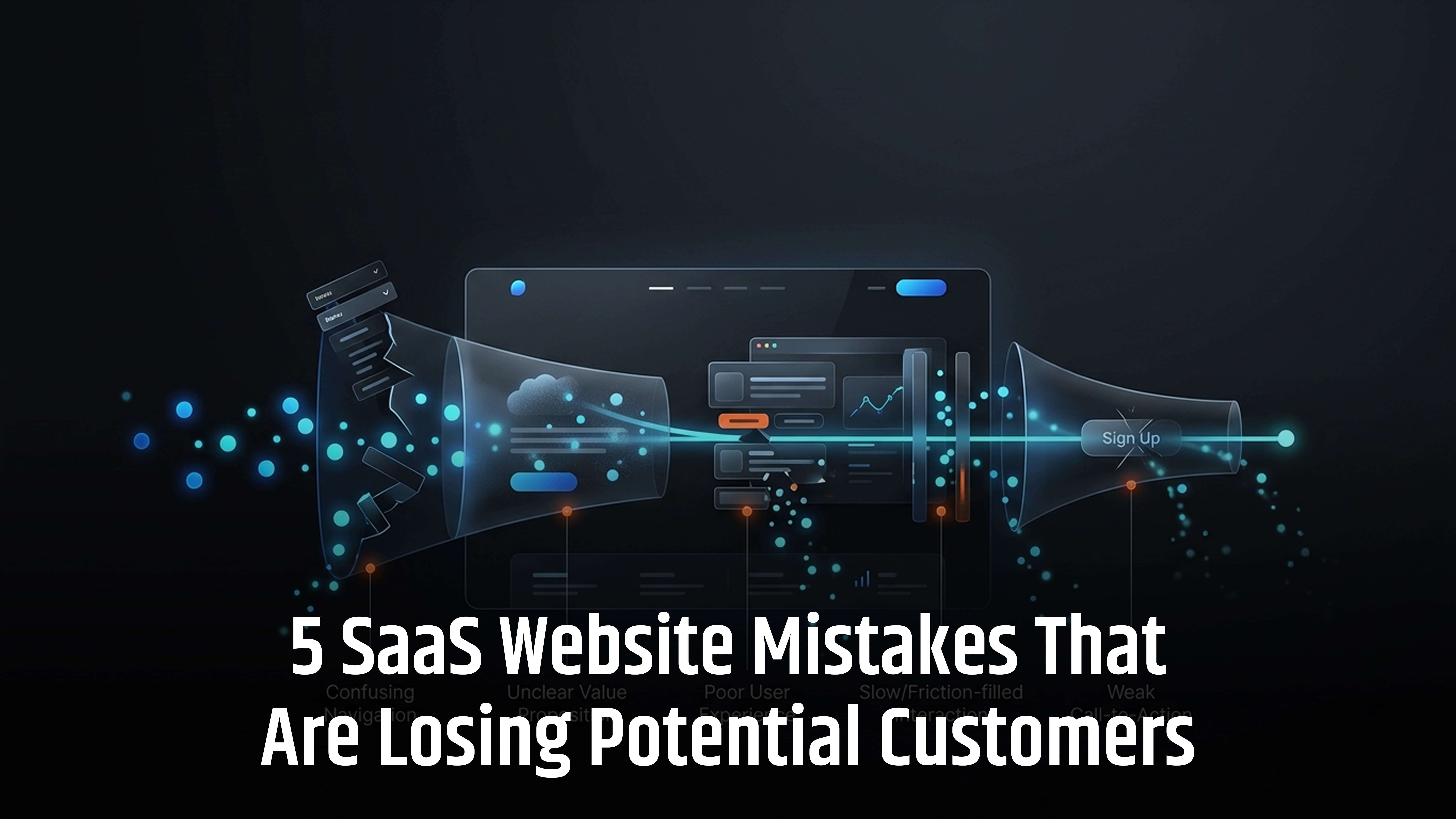
A SaaS website can look great and still lose potential customers. Often, the problem is not the product itself, but unclear messaging, poor user experience, weak trust signals or a confusing path to conversion.
The five most common SaaS website mistakes are unclear value propositions, poor UX, limited buying information, weak trust signals, and ineffective SEO and conversion structure.
In 2026, SaaS buyers are researching products across Google, AI search, review sites and online communities before making a decision. Whether you are improving your existing website or working with a website development company in the UK, your site needs to make it easy for visitors to understand your product, trust your business and take the next step.
In this guide, we’ll look at five SaaS website mistakes that could be costing you qualified leads and customers.
Why SaaS Websites Lose Customers Quietly
SaaS websites often lose potential customers because they make it harder than necessary to understand, evaluate or act on the product. The website may look professional, load properly and have all the right features, yet visitors can still leave without signing up or requesting a demo.
Common problems include:
- A headline that does not clearly explain the product
- Slow or difficult-to-use mobile pages
- Confusing navigation
- Limited pricing or product information
These issues may seem small individually, but together they can create enough friction to stop a potential customer from converting.
The solution is not always a complete website redesign. Start by checking whether your website clearly answers five basic questions:
What is the product? Who is it for? What problem does it solve? Why should I trust it? What should I do next?
If your website does not answer these questions quickly and clearly, these are the five areas you should review first.
5 SaaS Website Mistakes That Could Be Costing You Customers
Small website issues can create friction, reduce trust and stop potential customers from taking the next step.
1. Your SaaS Value Proposition Is Unclear
Visitors should understand what your product does, who it is for and why it is important within seconds. If they have to figure this out themselves, they are more likely to leave.
For example:
Weak: “The next generation of intelligent business automation.”
Clear: “Automate invoice processing for finance teams without changing your existing accounting system.”
The second example tells visitors exactly what the product does, who it helps and what problem it solves.
What your homepage should answer
Your homepage should quickly explain:
- What does the product do?
- Who is it for?
- What problem does it solve?
- What benefit does it provide?
- What should the visitor do next?
Avoid filling your headline with vague terms such as innovative, next-generation, seamless or AI-powered unless you explain what they actually mean.
Simple rule: Lead with the customer's problem and the outcome, not marketing language.
2. Your Website Creates Unnecessary Friction
Even with clear messaging, visitors can leave if your website is difficult to use.
Common problems include:
- Slow-loading pages
- Confusing navigation
- Poor mobile usability
- Long or complicated forms
- Unclear buttons
- Too many pop-ups
- Difficult-to-read content
- Broken links or pages
The goal is simple: make it easy for visitors to find information and take action.
Check your main journeys, such as:
Google → Landing page → Product → Pricing → Sign up
and
Blog → Relevant solution → Product → Demo
At every step, ask:
“Is there anything here that could make the visitor leave?”
Also test your website on real mobile devices. A site can be technically responsive but still be frustrating to use.
3. You Ask Every Visitor to Buy Too Soon
Not every SaaS industry visitor is ready to book a demo or start a trial.
Some are still:
- Learning about a problem
- Comparing solutions
- Researching features
- Checking pricing
- Looking for integrations
- Evaluating security
- Comparing different providers
Your website should support these different stages instead of pushing every visitor towards a sales call.
Match content to buying intent
- Early research: Guides, how-to articles and educational content
- Solution research: Feature pages, solution pages and comparisons
- Vendor evaluation: Pricing, case studies, reviews, security and product demos
- Ready to buy: Free trial, demo, quote or contact sales
Your blog should also give readers a useful next step. For example, an article about accounts payable automation could link naturally to your relevant product, features, integrations or pricing page.
The goal is not to push every visitor to buy. It is to help each visitor move to the next stage.
4. Your Website Does Not Build Enough Trust
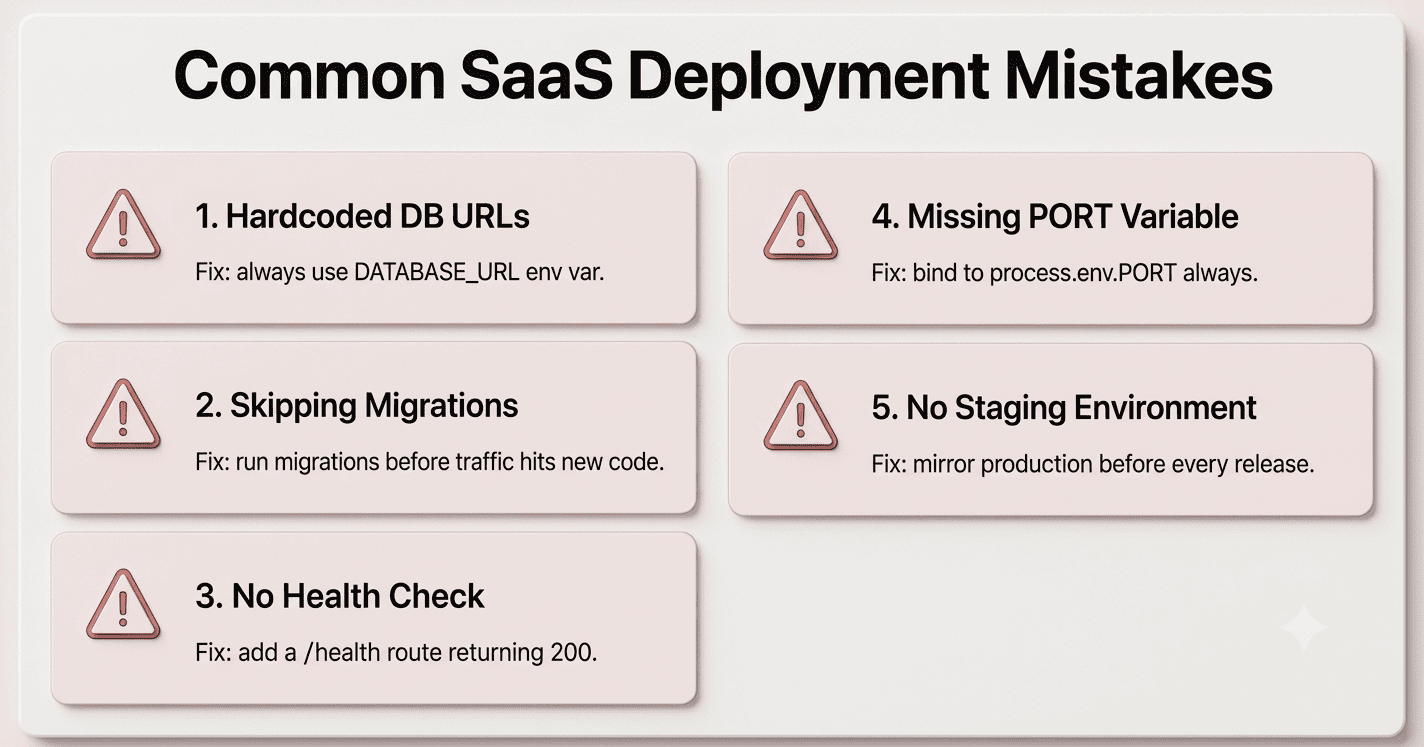
SaaS customers need to feel confident before they share their data, start a subscription or introduce new software into their business.
Simply saying “We are trusted” is not enough. Show visitors why they should trust you.
Useful trust signals include:
- Customer testimonials
- Case studies
- Customer logos
- Product screenshots
- Product demonstrations
- Reviews
- Security information
- Integration details
- Clear company information
- Helpful documentation
For B2B SaaS, also make important buying information easy to find, such as pricing, support, implementation and security details.
The key principle is simple: replace claims with evidence wherever possible.
5. Your SEO and Conversion Structure Are Disconnected
SEO Services should not simply bring visitors to your website. It should help them find the right information and take the right next step.
Start by checking the basics:
- Clear page titles and headings
- Logical internal links
- Search-friendly URLs
- Proper indexing
- XML sitemap
- Mobile usability
- Fast page performance
- Useful, relevant content
- Structured data where appropriate
But technical SEO is only part of the picture. A page can rank well and still fail to convert if it does not answer the visitor's question or provide a useful next step.
Build connected content
Instead of publishing unrelated blog posts, create groups of content around your main product or service.
For example, a project management SaaS company could create content around:
- Project management software
- Project management for agencies
- Project management pricing
- Project management comparisons
- Project management integrations
- Project management templates
Link these pages naturally to relevant product and solution pages.
Good SEO brings the right people to your website. Good website structure helps them find what they need and take action.
A sixth problem worth checking: your pricing page creates uncertainty
Although the focus of this article is five mistakes, pricing deserves separate attention because it often sits directly between interest and purchase.
A pricing page should help someone decide whether your product is suitable.
It should answer questions such as:
- How much does it cost?
- What determines the price?
- What is included?
- Which plan is suitable for me?
- Are there limits?
- Is there a free trial?
- Is there a minimum contract?
- Can I cancel?
- What happens when I exceed a limit?
- Is implementation included?
- Is support included?
- Are there additional charges?
NerdCow's 2026 analysis makes a similar distinction between simplicity and clarity: a pricing page can be visually simple while still failing to give buyers enough information to make a decision.
What SaaS Websites Should Focus on in 2026
SaaS buyers now research products across Google, AI search, review sites and online communities. Your website should therefore focus on clear, useful and trustworthy content rather than simply targeting keywords.
Create Helpful Content
Use clear headings, direct answers, practical examples, credible sources and original insights. Make every page useful to the reader.
Show Your Expertise
Add a named author, relevant bio, credible sources and a clear update date where appropriate. This helps readers understand who created the content and why they can trust it.
SaaS website mistakes checklist
Use this as a quick review.
|
Website area |
Question to ask |
|
Homepage |
Can visitors understand the product quickly? |
|
Value proposition |
Is the customer problem clear? |
|
Audience |
Is the target customer obvious? |
|
Navigation |
Can visitors find important information easily? |
|
Mobile |
Does the site work properly on a phone? |
|
Performance |
Are Core Web Vitals and page speed being monitored? |
|
Pricing |
Can buyers understand plans and costs? |
|
Trust |
Is there enough evidence to support buying decisions? |
|
Product pages |
Do they explain outcomes as well as features? |
|
Content |
Does the blog answer real customer questions? |
|
Internal linking |
Can readers move naturally between related pages? |
|
CTAs |
Does every important page offer a relevant next step? |
|
Forms |
Are you asking for information you actually need? |
|
SEO |
Can search engines crawl and understand the important pages? |
|
Accessibility |
Can people with different needs use the website? |
|
Analytics |
Are you measuring meaningful conversions rather than traffic alone? |
Conclusion
A SaaS website does not need to be complicated to convert visitors into customers. It needs to be clear, fast, trustworthy and easy to navigate.
Start by fixing the basics: explain your value clearly, remove unnecessary friction, provide useful information at every stage of the buying journey, build trust with real evidence, and connect your SEO and conversion paths.
Small improvements across these areas can make it easier for the right visitors to understand your product and take action.
Need Help Improving Your SaaS Website?
If your SaaS website is struggling with UX, SEO, performance or conversions, WOWinfotech can help. Our website development team can build or improve a SaaS website that is designed around your users, business goals and growth.
Frequently asked questions
If visitors cannot quickly understand what the software does, who it is for and why it is relevant to them, other improvements become harder to benefit from.
Review:
- landing pages
- pricing pages
- sign-up forms
- demo forms
- product pages
- mobile journeys
- page speed
- calls to action
Then test specific changes rather than redesigning everything at once.
Also be careful with SaaS conversion benchmarks. Published 2026 benchmarks vary significantly depending on whether the measurement is whole-site visitor-to-lead, landing-page conversion, free-trial signup or another action.
However, some enterprise SaaS products have highly variable pricing based on users, usage, integrations, security requirements or implementation.
In those cases, the website should still explain the pricing model and what influences the final cost.
People may discover the product, read an article, check pricing, share a page or research the company on mobile before returning on another device.
A mobile experience should therefore be treated as part of the complete customer journey.
Performance should therefore be monitored as both a user-experience and technical issue. Core Web Vitals are also part of Google's page-experience considerations.
However, improving page speed does not guarantee a higher conversion rate. If the message, product fit or offer is unclear, a faster version of the same page may still perform poorly.
Contact us to get a digital strategy
Contact us for digital strategy guidance.