
Your customers are already searching, browsing and making buying decisions on their phones. Is your website giving them a reason to stay or a reason to leave? A slow page, difficult navigation, tiny buttons or a layout that does not fit the screen can quickly push a potential customer towards a competitor.
This is why understanding what mobile-first design is important for every business owner, not just web designers and developers.
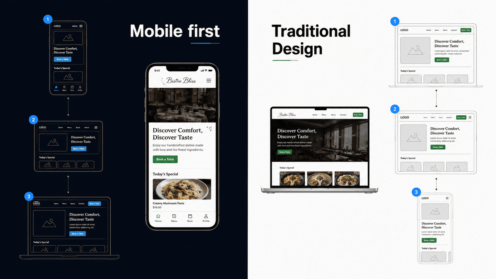
Mobile-first design means creating a website for smaller screens first and then enhancing it for tablets, laptops and desktops. Rather than squeezing a desktop website onto a phone, the approach prioritises essential content, simple navigation, fast performance and easy interactions from the start.
When combined with mobile-first responsive design and responsive web design, it helps create a website that works smoothly across different devices while providing a consistent and user-friendly experience.
Understanding Mobile First Design
Many people think mobile-first design simply means making a website look good on a phone. In reality, it goes much further.
A mobile-first website is planned around the needs of users who browse using touchscreens, slower mobile networks, and smaller displays. Every design decision focuses on simplicity, speed, and usability.
This includes:
- Easy navigation
- Fast page loading
- Readable typography
- Optimised images
- Touch-friendly buttons
- Clear content hierarchy
- Accessible forms
- Responsive layouts
Once these essentials work perfectly on mobile, the design expands naturally for larger screens.
Why is Mobile-First Design Important in 2026?
Mobile is now a key part of how customers search, compare and contact businesses online. A slow or difficult mobile website can lead to lost visitors, enquiries and sales. Mobile-first design focuses on speed, usability and simple navigation from the start, helping businesses provide a better experience across devices.
Google Mobile-First Indexing
Google uses the mobile version of a website for indexing and ranking. This makes mobile optimisation an important part of modern SEO. Your website should offer fast loading, clear navigation, responsive layouts, accessible content and a consistent experience across devices.
Changing User Expectations
Mobile users expect websites to be quick and easy to use. They want to find information, tap buttons, complete forms and read content without unnecessary effort. Mobile-first responsive design helps meet these expectations while supporting a smoother overall user experience.
The Evolution of Website Design
Website design has evolved significantly, and modern website design services now focus on creating fast, responsive and user-friendly experiences across mobile, tablet and desktop devices.
1. Desktop-First Design
In the early days of the web, websites were designed for desktop computers because most users accessed the internet through large monitors.
Designers focused on:
- Wide layouts
- Large navigation menus
- Multiple sidebars
- Heavy graphics
When smartphones became popular, many websites simply squeezed desktop layouts onto smaller screens. The result was poor usability.
2. Responsive Web Design
Responsive web design improved this by allowing layouts to adapt automatically to different screen sizes.
Using flexible grids, media queries, and scalable images, websites could display correctly across desktops, tablets, and phones. Responsive web design remains essential today.
However, responsive design alone does not guarantee a good mobile experience.
3. Mobile-First Responsive Design
Modern websites combine responsive web design with a mobile-first strategy.
This means:
- Build the mobile version first.
- Use responsive techniques to enhance larger screens.
- Maintain consistent performance across all devices.
This approach produces cleaner code, better usability, and stronger performance.
Mobile First Design vs Responsive Web Design
These terms are often confused, but they are not exactly the same.
|
Mobile First Design |
Responsive Web Design |
|
Design starts with mobile devices |
Layout adapts to different screen sizes |
|
Focuses on core content first |
Focuses on flexible layouts |
|
Uses progressive enhancement |
Uses flexible grids and media queries |
|
Prioritises speed and usability |
Prioritises compatibility across devices |
|
Simplifies navigation |
Rearranges content based on screen size |
The best websites use both mobile-first design and responsive web design together.
Core Principles of Mobile First Design
Successful mobile-first websites share several key principles.
1. Prioritise Essential Content
Focus on what users need first. Remove unnecessary distractions and place important information where visitors can easily find it.
2. Design for Touch
Unlike desktop users, mobile visitors interact using their fingers.
Buttons should be:
- Large enough to tap comfortably
- Well spaced
- Easy to recognise
Avoid tiny links or closely packed controls.
3. Keep Navigation Simple
Mobile menus should be straightforward.
Use:
- Clear labels
- Logical categories
- Collapsible menus
- Visible search where appropriate
Avoid overwhelming users with too many options.
4. Optimise Performance
Fast websites create better user experiences.
Optimise:
- Images
- Fonts
- CSS
- JavaScript
- Caching
- Server response times
Every second saved improves usability.
5. Ensure Readability
Content should be easy to read without zooming.
Use:
- Clear headings
- Short paragraphs
- Bullet points
- Adequate spacing
- Readable font sizes
Benefits of Mobile-First Design
A mobile-first design approach can improve user experience, website performance, SEO and lead generation. Key benefits include:
1. Better User Experience
Simple navigation, readable content and clear actions make it easier for visitors to use your website.
2. Improved Performance
Mobile-first websites prioritise lightweight layouts, optimised images and efficient code, helping pages load faster.
3. Supports SEO
A well-built mobile-first responsive design supports mobile usability, page performance and Google's mobile-first indexing.
4. More Conversions
Clear layouts and simple forms make it easier for visitors to enquire, book a service or make a purchase.
5. Lower Bounce Rates
Fast loading, readable content and easy navigation can encourage visitors to stay and explore.
Practical Strategies for Mobile-First Design
Understanding what mobile-first design is only the starting point. The real benefit comes from applying mobile-first principles throughout the planning, design, development and SEO process.
For business owners, the goal is simple: create a website that helps visitors find information quickly, understand your offering and take action without frustration. The following strategies can help you achieve that.
1. Start With Content, Not Design
Good mobile-first design begins with understanding what your visitors actually need.
Before choosing layouts, colours or animations, identify:
- What information does the visitor need first?
- What problem are they trying to solve?
- What action should they take?
- Which information is essential?
- Which content can be removed or moved further down the page?
This approach creates a website based on user intent rather than decorative elements. It also makes it easier to create a clear content structure that works across different screen sizes.
2. Build a Clear Information Hierarchy
Mobile screens provide limited space, so information needs to be presented in the right order.
A typical business service page could follow this structure:
- Clear headline -Explain immediately what the page offers.
- Short introduction -Give visitors the essential context.
- Key benefits -Explain why the service matters.
- Services or solutions -Show what the business provides.
- Trust signals -Include reviews, testimonials, certifications or relevant experience.
- FAQs -Address common customer concerns.
- Call to action -Give visitors a clear next step.
- Contact options -Make it easy to enquire or get in touch.
A logical hierarchy allows users to scan the page instead of reading every section from top to bottom.
3. Design for Small Screens First
The foundation of mobile-first responsive design is to begin with the smallest practical screen size.
Start by deciding how the essential content and functionality will work on a smartphone. Once that experience is clear, progressively enhance the layout for:
- Tablets
- Laptops
- Desktop computers
- Large displays
This approach helps prevent unnecessary features from being added simply because there is more space available on a desktop screen.
The result is a more focused experience that can then expand naturally as the viewport becomes larger.
4. Use Flexible Responsive Layouts
Responsive web design allows a website to adapt to different screen sizes instead of relying on fixed-width layouts.
A responsive layout can use:
- Flexible containers
- Fluid grids
- Responsive typography
- Flexible images
- CSS media queries
- Relative sizing units
The objective is not simply to make a desktop page smaller. The layout should reorganise itself so that content remains readable and usable on every device.
For example, a three-column desktop layout may become a single-column layout on a smartphone.
5. Optimise Images for Mobile Performance
Large image files can significantly affect page loading, particularly for users on mobile networks.
Before publishing images:
- Compress files to reduce their size.
- Use modern formats such as WebP or AVIF where appropriate.
- Serve images at suitable dimensions.
- Use responsive image techniques for different screen sizes.
- Lazy-load images that are below the initial viewport.
- Add meaningful alt text where images convey information.
Image optimisation can improve page performance without sacrificing visual quality.
6. Make Content Easy to Read
Mobile visitors often scan content rather than reading every paragraph.
Avoid presenting large blocks of text. Instead:
- Keep paragraphs relatively short.
- Use descriptive headings.
- Break complex information into smaller sections.
- Use bullet points for lists.
- Highlight important information where appropriate.
- Leave enough white space between elements.
Good content structure benefits both visitors and search engines because it makes the relationships between different topics easier to understand.
7. Keep Mobile Navigation Simple
A mobile navigation menu should make it easy for visitors to find important pages without overwhelming them.
For a typical business website, primary navigation might include:
- Home
- About
- Services
- Pricing
- Blog
- Contact
The exact structure should depend on the website and its users.
Avoid creating unnecessarily deep navigation systems. If visitors need several taps to reach an important service or contact page, the navigation may need to be simplified.
A useful question to ask is: Can a visitor find what they need without having to think too much?
8. Make Forms Easy to Complete
Forms are often an important part of lead generation, but they can become difficult to use on smaller screens.
A mobile-friendly form should:
- Ask only for information that is genuinely required.
- Use appropriately sized input fields.
- Include clear labels.
- Use suitable input types for mobile keyboards.
- Support browser autofill where appropriate.
- Show clear validation messages.
- Explain what needs to be corrected when an error occurs.
For example, if a business only needs a visitor's name, email address and enquiry, there may be little reason to ask for ten additional fields.
The easier the form is to complete, the less friction there is between a potential customer and an enquiry.
9. Use Clear Calls to Action
Every important page should give visitors a clear next step.
Depending on the business, this could be:
- Request a quote
- Book a consultation
- Call the business
- Send an enquiry
- Make a booking
- Download a guide
- Get started
Avoid giving equal visual importance to several competing actions.
For example, if the main purpose of a service page is lead generation, "Request a Quote" may be more useful as the primary CTA than presenting five different actions at the same level.
10. Design for Touch Interaction
Mobile users interact with websites using their fingers rather than a mouse. Interactive elements therefore need to be comfortable to use.
Make sure buttons and links:
- Are large enough to tap comfortably.
- Have sufficient spacing from other controls.
- Use clear labels.
- Provide visible interaction feedback.
- Do not depend on precise mouse movements.
Avoid placing several small links close together, as this can lead to accidental taps and a frustrating experience.
Technical SEO Considerations for Mobile-First Websites
Mobile-first design should not be treated separately from technical SEO. The website's structure, content, performance and accessibility all contribute to how effectively search engines can crawl, understand and present its pages.
1. Keep URLs Simple and Descriptive
Use URLs that clearly communicate the subject of the page.
For example: yourwebsite.co.uk/mobile-first-design
is easier to understand than: yourwebsite.co.uk/page?id=1847
Good URLs should generally be:
- Short
- Descriptive
- Readable
- Relevant to the page
- Consistent across the website
2. Use a Logical Heading Structure
Headings help users scan content and help search engines understand the organisation of a page.
Use:
- H1 for the main page topic
- H2 for major sections
- H3 for supporting subsections
- H4 where further levels of detail are genuinely required
For example:
H1: Mobile-First Design
H2: Benefits of Mobile-First Design
H3: Better Mobile User Experience
H3: Improved Website Performance
The aim is to create a logical hierarchy rather than use headings simply to make text appear larger.
3. Build a Strong Internal Linking Structure
Internal links connect related pages across your website and help visitors discover useful information.
For a website covering mobile-first design, relevant internal links could include:
- Responsive web design
- UX design
- Website accessibility
- Core Web Vitals
- Technical SEO
- Website performance
- Conversion rate optimisation
- Website development
Use descriptive anchor text that tells users what they can expect after clicking.
A well-organised internal linking structure also helps search engines understand how your content is related.
4. Use Structured Data Where Appropriate
Structured data provides search engines with additional information about the content of a webpage.
Depending on the page, relevant structured data may include:
- Article
- Breadcrumb
- Organisation
- LocalBusiness
- Product
- Review
Use only structured data that accurately represents the visible content on the page and follows the relevant search engine guidelines.
Structured data should support your SEO strategy rather than replace useful, well-written content.
5. Monitor Core Web Vitals
Website performance should be measured rather than judged by appearance alone.
Google's Core Web Vitals include:
- Largest Contentful Paint (LCP) -measures loading performance.
- Interaction to Next Paint (INP) -measures how quickly a page responds to user interactions.
- Cumulative Layout Shift (CLS) -measures unexpected movement of page content.
These metrics can help identify problems that affect real users.
For example, a page may look visually complete but still provide a poor experience if a large image loads late or buttons move while the page is loading.
Use tools such as Google Search Console, PageSpeed Insights and Lighthouse to monitor performance and identify areas for improvement.
6. Make Accessibility Part of the Process
Accessibility should be considered from the beginning of the design process rather than added as a final check.
Important areas include:
- Descriptive alternative text for meaningful images
- Keyboard accessibility
- Visible focus indicators
- Logical heading structure
Following recognised accessibility practices, including the Web Content Accessibility Guidelines (WCAG), can make websites easier to use for a wider range of people.
Accessibility also often improves the overall usability of a website because clear navigation, readable content and well-structured pages benefit everyone.
A Practical Mobile-First Checklist
Before launching a mobile-first website, check the following:
Content
- Is the most important information easy to find?
- Are pages structured around user intent?
- Are unnecessary sections removed?
Design
- Does the layout work comfortably on small screens?
- Is the typography readable?
- Are buttons and links easy to tap?
Navigation
- Can visitors reach important pages quickly?
- Is the mobile menu simple?
- Are important contact options easy to find?
Performance
- Are images optimised?
- Are unnecessary scripts removed?
- Are Core Web Vitals being monitored?
SEO
- Are headings structured logically?
- Are URLs descriptive?
- Are related pages internally linked?
- Is structured data used appropriately?
Accessibility
- Can the website be navigated using a keyboard?
- Are forms properly labelled?
- Is colour contrast sufficient?
- Can assistive technologies understand the content?
A website does not need to be complicated to provide a strong mobile experience. The most effective approach is often to remove unnecessary friction and make the important things easier to find, understand and use.
Mobile-First Design Best Practices for 2026
Mobile technology, user expectations and search engine algorithms continue to evolve. While the core principles of mobile-first design remain the same, following current best practices helps your website stay competitive and provide a better experience for users.
1. Design Around User Intent
Before creating any page, ask:
- Why is someone visiting this page?
- What information are they looking for?
- What action should they take next?
Every page should have a clear purpose. Avoid adding unnecessary elements that distract visitors from completing their goal.
2. Focus on Content Hierarchy
Users rarely read every word on a webpage. Instead, they scan headings, images and highlighted information.
Make your content easy to scan by using:
- Descriptive headings
- Short paragraphs
- Bullet points
- Numbered lists
- Tables where appropriate
- Highlighted key takeaways
This improves readability for both users and search engines.
3. Keep Navigation Consistent
Whether users are on a smartphone, tablet or desktop computer, navigation should feel familiar.
Maintain consistency by:
- Using the same menu labels
- Keeping important pages easy to access
- Displaying contact information clearly
- Providing a visible search function for larger websites
4. Optimise Every Image
Images should improve understanding rather than slow down your website.
Follow these practices:
- Compress files before uploading
- Use responsive image sizes
- Write descriptive alt text
- Choose modern formats such as WebP or AVIF
- Avoid decorative images that add little value
5. Write for Mobile Readers
Large blocks of text can be difficult to read on smaller screens.
Instead:
- Limit paragraphs to two or three sentences
- Use clear subheadings
- Include examples
- Explain technical terms in plain English
- Break up long sections with lists
Simple writing improves user engagement and accessibility.
6. Prioritise Accessibility
Accessible websites benefit everyone.
Review your website for:
- Colour contrast
- Keyboard navigation
- Screen reader compatibility
- Descriptive link text
- Form labels
- Captions for video content
Accessibility also supports inclusive design and helps more people use your website effectively.
7. Test Regularly
Don't assume your website works perfectly because it looks good on one device.
Test:
- Different smartphones
- Tablets
- Desktop browsers
- Operating systems
- Internet connection speeds
Regular testing helps identify usability issues before they affect customers.
Useful Tools for Mobile-First Design
The right tools make it easier to create, test and improve a mobile-first responsive design.
1. Design Tools
- Figma
- Adobe XD
- Sketch
- Penpot
These tools allow designers to create responsive layouts, interactive prototypes and collaborative design systems.
2. Development Tools
Developers commonly use:
- HTML5
- CSS
- JavaScript
- Tailwind CSS
- Bootstrap
These technologies help build responsive websites that adapt to different screen sizes.
3. Performance Tools
Monitor website speed with:
- Google PageSpeed Insights
- Lighthouse
- GTmetrix
- WebPageTest
These tools identify opportunities to improve loading times and overall performance.
4. SEO Tools
Useful SEO tools include:
- Google Search Console
- Google Analytics
- Ahrefs
- Semrush
- Screaming Frog SEO Spider
These platforms help monitor rankings, indexing, user behaviour and technical SEO issues.
Conclusion
Mobile users are now a core part of how customers discover, compare and choose businesses online. Mobile-first design helps you build a website around their needs by prioritising simple navigation, fast performance, readable content and easy interactions on smaller screens. Combined with mobile-first responsive design and responsive web design, it creates a consistent experience across smartphones, tablets and desktops while supporting usability, SEO and lead generation.
If your website is slow, difficult to use on mobile or no longer meets customer expectations, WOWinfotech can help. Our team can create a responsive, mobile-first website that is built around your users and business goals.
Get in touch with WOWinfotech today to discuss your website project and create a better mobile experience for your customers.
Frequently Asked Questions
Contact us to get a digital strategy
Contact us for digital strategy guidance.